Vision Paper Redesign
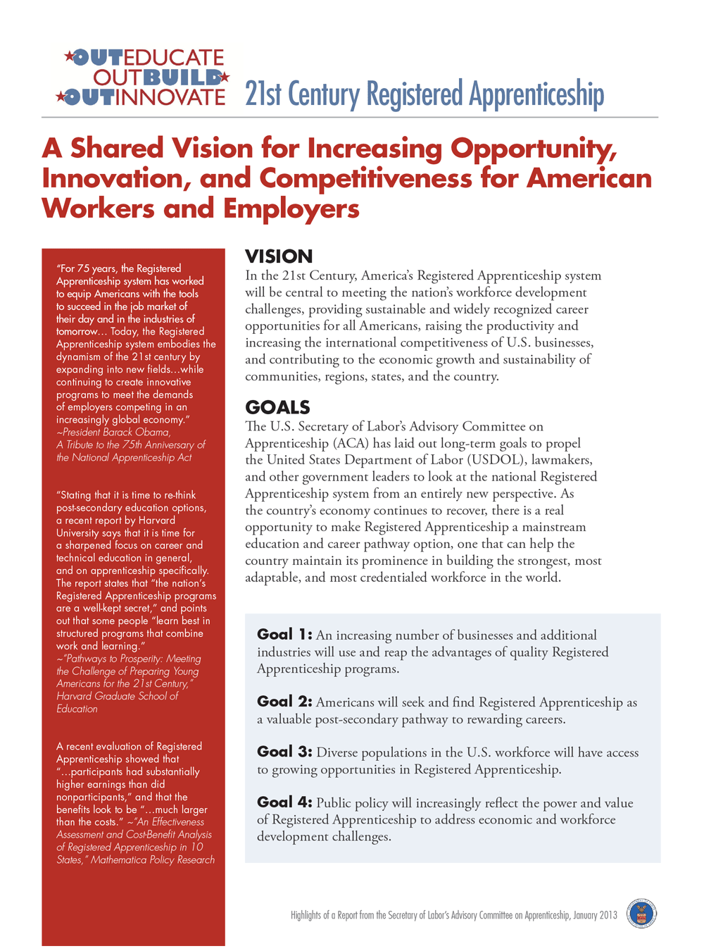
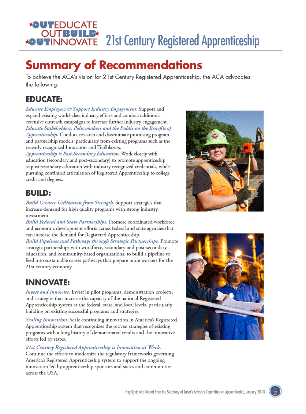
This paper came to me as a text file in need of a design. I knew there would be a few keys to making this paper visually compelling. I wanted to use white space to make the line lengths reader-friendly, and the typography to make a bold statement. I paired Futura and Garamond Pro. Since Futura was already a part of the Registered Apprenticeship logo, it seemed a natural choice for the heading text. Garamond paired well with it for the body. I broke the layout into distinct sections, to make the paper easier to parse visually, and to point out the important parts at a glance. The quotes, with the Apprenticeship logo red as a background color, now form a pleasing visual counterpoint to the body copy, and the goals section is set off by a tint of the Apprenticeship blue. I carried this look over into the second page of the document, and added some photography for extra interest. I feel that the end result is easy to read, inviting, and enhances the content.

